
Thursday, 22 January 2015
My Front Cover First Draft
Here is my first completed draft on my front cover. I have included all the typical conventions and explained what went well and how to improve using thing link.

Saturday, 17 January 2015
My Front Cover Pictures
Here is a slideshow of all of the pictures that were taken on my first photo shoot with Conor Jarvis. The location of these photos are behind the mobile classroom, by the social club near Plantsbrook school and outside the local church. All of these places had quite nice backgrounds such as brick walls and a wall to sit on over a stream.
Created with flickr slideshow.
Created with flickr slideshow.
Masthead change
My original masthead idea for my magazine was plain and black. I though that this gave the magazine a professional look to it. However, over time I have realised that to make more magazine more attractive, it should include colour. Since red has been a reoccurring colour in the indie-rock genre, I have decided to chose the colour red to include into my masthead.

Firstly, when adding colour, I changed the font colour. It turned out as shown below. I like this design more than just black as it is more engaging to the audience. I have kept the same size and font type. It is called blacklisted, and I downloaded it from a website named dafont.
 Afterwards, I decided that a background to my masthead would look good. This allows the masthead to be more than just a font but to look more as an image since it is inside a box. I made the background black, with a white font colour. I feel as the white on red was the best colours that matched together. This is my final design of my masthead, which will appear on my front cover designs from now.

Firstly, when adding colour, I changed the font colour. It turned out as shown below. I like this design more than just black as it is more engaging to the audience. I have kept the same size and font type. It is called blacklisted, and I downloaded it from a website named dafont.
Thursday, 15 January 2015
Wednesday, 14 January 2015
Updated Phootshoot Plan Timetable

Monday, 12 January 2015
Photo Shoot Planning
In order to do the photo shoot for my magazine I have had to do some planning in order for it to go to plan. Firstly, I made sure I had found the right people to model for my magazine. The first model that I have chosen in Conor Jarvis. He is a 17 year old boy who's favourite genre of music is Indie Rock. He has the look of a typical listener to this genre of music so he is a good candidate for my magazine model. The other possible candidate is Eve Foran who is a female who is also interested in the genre of my magazine. They are both within the age range I would like so this is good.
I then thought of the setting of my photo shoots. I would like it to be bright so that there is good lighting. For this I will have to take my photos before sunset and also when the weather isn't looking too grey. I also want there to be quite an interesting scenery. For example at the local skate park or on top of a multistory building to show a good backdrop. They are both near so that is good.
The devices that I use will have to be good megapixel. Therefore, I could possibly use an iPhone 6 since the camera on that is very good and improved. But an even better device I could use is my camera which has good megapixel and good for taking photos of people.
All of this has had to be taken into account and for me to be organised I have put together a Photo-shoot Timetable as shown below. This can let me see clearly, when who where and what I will be doing for my photoshoots and how I will prepare for them. I have included a weather screenshot so that I can adapt to the weather and bring the right things to work with the weather. They are both sunny so I will make sure the clothing is suitable.

For my male model Conor, I have put toegther a collage of how I would like his photos to turn out. I like the look of black and white photographs so they are common in the collage. The type of shot I like best for my front cover would be a midshot. This allows you to see the face and facial expressions clearly but also allows you to have an understanding of his attitude though the costume he is wearing and the way he is standing.
Having him stand against a brick wall is a photo shot that I like as the background doesn't distract from the artist, who I want to have the full attraction.

Here is the collage for the female model Eve. I also have taken a liking to the black and white photographs. I think that colours in a photograph can be somewhat distracting to what the photograph is actually of. The black and white style seems a lot more engaging and will be contrasted with the bright colours that will be over the top of the photo for the features.
I do not want my photos to be too serious and have too much makeup and hair design being put on the models. Since the target market of my magazine is ages 15-24, the magazine needs to be youthful, and I feel that can be achieved by having playful poses such as ones seen below.
For a female model, I think the best type of shot is a closeup of them from above the shoulders. The features of the model can be enhased through subtle make up which is why I think it would be good for that type of shot.

Here are the locations of the places I plan to take my photos on google maps.


Mood Board
This is a mood board for the target audience of my magazine involving everything which my magazine should take into account whilst being created. This includes all the interests and likes of my target audience such as their hobbies, the foods they like, the clothes they wear and bands they listen to etc. It also include products such as iPhones and cameras as my target audience will most likely own these products.

Sunday, 11 January 2015
Research Into Photography
I have carried out some research into different photographers and different photography types in order to make sure my magazine main images and smaller images are to best possible ability I can do.
There are two devices which I could take my photographs on.
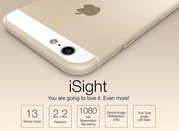
Firstly, I have the 8MB iSight camera on my iPhone 6. This comes with a new sensor with focus pixels, improved face detection and exposure control which will be good to allow me to take good quality, professional looking photographs.
My other device is a Cannon camera.
My research into photographers has allowed me to identify individuals whose pictures I particually like and will influence me when I am taking mine. These are Terry Richardson and Richard Burbridge.
Firstly, I like Terry Richardson's photographs as they are never too serious and usually involve messing around with props such as sweets/foods, glasses and animals. They also often include photos were the model is pulling funny faces giving off a relaxed mood. This would be good for my music magazine images as the target audience is ages 16-25, which means the pictures need to be youthful and fun.


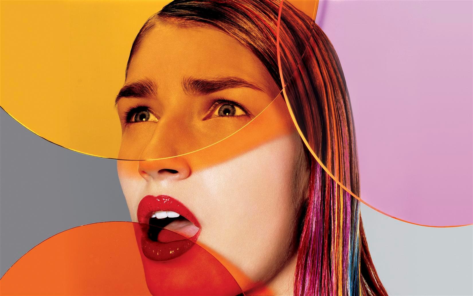
I like Richard Burbridge's photographs because they are artsy and have interesting edits on them and good make up. He also is a photographer that uses a lot of props such as snakes, snails, sweets, as shown in the pictures below. Richard Burbridge often is I-D's magazines photographer. I-D was the most popular chosen magazine front cover on my survey on my target audience using survey monkey, therefore suggesting his style of photography is popular within my target audience. He also does a lot of close-ups of the models faces which focuses on features of their face such as their eyes which I also like.


The types of photography shots I have found myself to like are closeups of the face, including their shoulders to let the audience see part of their outfit. Close up of the face allow to show emotion in the face which will be good for a magazine front cover image as it will draw the viewer in as close ups of faces are interesting and captivating.
I also have like mid-shots or long shots of models. This allows the viewer to grasps a full understanding of the model and what the photograph is trying to represent.
I like photos which include appropriate props that will link to my anchorage text, for example a guitar or drum sticks, however this depends on the story.
My photograph will be against a brick wall, white wall in my house or a white backdrop. I think these both look professional and they are the styles that I have like the most throughout my research.


There are two devices which I could take my photographs on.
Firstly, I have the 8MB iSight camera on my iPhone 6. This comes with a new sensor with focus pixels, improved face detection and exposure control which will be good to allow me to take good quality, professional looking photographs.
My other device is a Cannon camera.
My research into photographers has allowed me to identify individuals whose pictures I particually like and will influence me when I am taking mine. These are Terry Richardson and Richard Burbridge.
Firstly, I like Terry Richardson's photographs as they are never too serious and usually involve messing around with props such as sweets/foods, glasses and animals. They also often include photos were the model is pulling funny faces giving off a relaxed mood. This would be good for my music magazine images as the target audience is ages 16-25, which means the pictures need to be youthful and fun.
I like Richard Burbridge's photographs because they are artsy and have interesting edits on them and good make up. He also is a photographer that uses a lot of props such as snakes, snails, sweets, as shown in the pictures below. Richard Burbridge often is I-D's magazines photographer. I-D was the most popular chosen magazine front cover on my survey on my target audience using survey monkey, therefore suggesting his style of photography is popular within my target audience. He also does a lot of close-ups of the models faces which focuses on features of their face such as their eyes which I also like.
The types of photography shots I have found myself to like are closeups of the face, including their shoulders to let the audience see part of their outfit. Close up of the face allow to show emotion in the face which will be good for a magazine front cover image as it will draw the viewer in as close ups of faces are interesting and captivating.
I also have like mid-shots or long shots of models. This allows the viewer to grasps a full understanding of the model and what the photograph is trying to represent.
I like photos which include appropriate props that will link to my anchorage text, for example a guitar or drum sticks, however this depends on the story.
My photograph will be against a brick wall, white wall in my house or a white backdrop. I think these both look professional and they are the styles that I have like the most throughout my research.
Saturday, 10 January 2015
Magazine Treatment Plan

Here is the treatment for my music magazine production, NOISE. It summaries everything about my magazine from the people who are reading it, who I am representing throughout the magazine, how my magazine looks and what I value in my magazine. This was a good tool to help me realise how I am going to put together my magazine and remind me of things I need to keep in mind whilst creating it.
Subscribe to:
Comments (Atom)